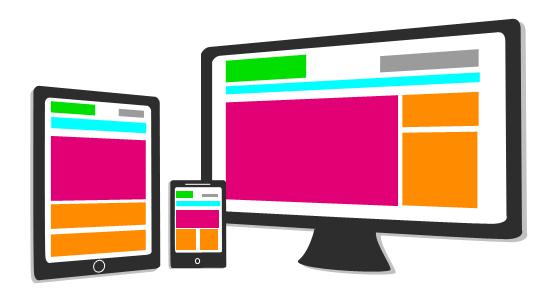
Responsive web design is nothing but adapting the layout of the site to fit into the display of the device be it a computer, phone, kindle, etc. To put this in a nutshell, this is all about how responsive a website is built to adjust and fit into the viewable area to achieve best fit. This is done so that a website fits into the display area of computers and hand held devices. In this responsive web designing, relative units for sizing and images are used. Instead of pixels, percentages are used as relative sizing units to achieve a good responsive design. This technique allows you to achieve browser compatibility and optimal user experience. A good professional web design company can help you achieve this responsive design and orientation for your website by creating fluid grids and images of relative units. This orientation has to be done in such a way that it is proportionate and also does not compromise on the quality of the images and text. This technique makes way for unmatched positive user experience and also makes the management of SEO strategies easier. Responsive web design is highly recommended for good traffic, high ranking in search results, credibility and competition.


Recent Comments